Sunday, July 18, 2010

Designer collections?

This post is meant mostly for our designers, but others do feel free to contribute. We’re toying with the idea of cards recruited not from the contest mechanic, but through one of the following models:-

1. Paying a designer a set fee for a collection of 10 cards, for which after they will continue to collect royalties.

2. Recruiting non-contest cards with a significantly higher Royalty scheme (say US$0.30) per card.

3. Some other brilliant business model that we haven’t thought of yet.

What do you think? Really would appreciate your feedback here…

Thursday, July 8, 2010

Announcing the winners of “A Modern Fairytale” greeting card contest

Wow… we’re on schedule for once! Once again, it’s time to announce the winners of our first ever wedding card contest, A Modern Fairytale. The contest challenged designers to reinvent wedding cards into something more hip and modern. From the response we’re getting so far, I’ve gotta say… mission accomplished.

Before we get to the results, let’s cap out the new rules for this contest.

  • There are now 10 prizes instead of 5!
  • Final scores are calculated from 70% public vote and 30% Foldees staff votes

With that in mind, may we also say that royalty jumps for wedding cards will be coming suddenly and quickly. A typical order for wedding cards is at least 200, which means US$20 in royalties immediately!

In other words, don’t be too disappointed if you don’t win :)

Alright, enough with the pleasantries. Let’s get matrimonial!

10. ellipsiSave The Date for Something (Prize: US$100)

2010050418545709470994318874_ellipsi_Save-the-Date-for-something_TALL

I really really like this design. Let’s hope that this new designer, ellipsi, stays with us for a while. As many of you know, our preference has always been on simplicity, and in the case of wedding cards, elegance. This one hits all those right notes and yet presents itself as a modern intepretation. She has another great design in her Gate of Love submission so do be sure to check that out as well.

9. Fox - Priceless (Prize: US$100)
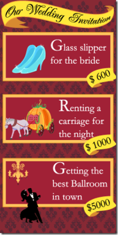
2010051910070906770876561971_Fox_Priceless_TALL

Fox is fast joining the ranks of our regular winners like Salchipunk and Kokuzo in churning out consistently smart and nice designs. In fact, in his own words, he salchipunk-ed this design with the trademark three tier idea, jibbing the famous VISA priceless ad campaign.

Damn, those are expensive glass slippers.

8. xhenRed Thread of Fate (Prize: US$100)

2010051716264302080839040375_xhen_red-thread-of-fate_SPLIT

This one was one of the staff favourites! Since our staff is primarily Chinese, we really appreciated the modern look yet classic message of this design, playing on the red thread that is synonymous with Chinese weddings. It’s also one of the best uses of the SPLIT template we’ve seen, and we were surprised that it didn’t score even higher than its credible 8th place.

Not to worry though, xhen, I’m sure it’ll earn shedloads in royalties

7. catpowersTie The Knot (Prize: US$100)

2010051801310708961759486574_catpowers_tie-the-knot_SQUARE

Another really simple and appealing design, using almost exactly the same shade of blue as ellipsi’s. I especially like how the designer has incorporated the elements bringing two people together, without cluttering the card.

Also, the use of red at the bottom in its sparing is very very effective.

6. salchipunkHappy Ending (Prize: US$100)

2010050916392108961759486574_salchipunk_Happy-Ending_TALL

The master returns to do what he does best. A charmingly illustrated, three-tier design of our favourite classics. Honestly, alot of the joy from seeing salchipunks designs are just to see his interpretations of characters we all know and love.

In this case, we absolutely love his rendition of The Beast, and quietly note the fact that all three princesses are different.

5. pastelineStatus: Married (Prize: US$150)

2010051819090205991415205616_pastelline_Status-Married_TALL

Another new designer that fast became joint top-office rated card. The concept itself is simple, but the execution is nearly flawless for this MSN Messenger wedding card. We love how the inside opens up to reveal a conversation window where couples can put their own conversations, and how the designer chose the TALL template to replicate exactly how the window appears in real life.

We reckon this one is going to sell truckloads. Welcome to the winner’s circle, pasteline :)

4. greenwong - Classic Wedding Card (Prize: US$150)

2010060217592305140543001469_greenwong_classic-wedding-card_SQUARE

Another new winner! This one almost didn’t make it through cos she initially submitted rasters. Thankfully, due to the captivating design, we did give her one extra day to complete her design and send it in.

Many of you seem to be showing gratitude that we did, propelling this new designer to our coveted Top Five! It’s a very detailed illustration, with a nice use of colour, that we can definitely see people picking up.

3. Richard Lee - Lasting Love (Prize: US$300)

2010052411521006701613197826_Richard-lee_Lasting-love_SQUARE

It’s honestly been a while since we’ve had this anime-inspired style win our contest (last one was this excellent anime robot birthday card!). Richard Lee submitted two entries, and while both were great, the simplicity and grace of a couple locking hands on the cover of this one edged this ahead substantially (the other design fell out of the top ten by a whisker.)

Perfect for newlywed couples that love anime. Hmmm… wonder where we’ll find some of those?

2. cscottdraw  - Forever & Always (Prize: US$400)
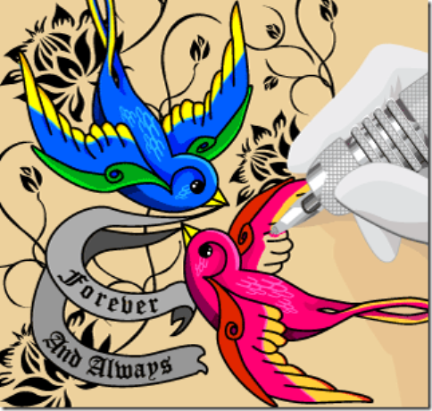
2010051422222408180150646572_cscottdraw_Forever-and-Always_SQUARE

Chelsey has been with us for quite some time now, but hasn’t cracked the winners circle until now. This is what we were looking for when we created this contest. A modern intepretation of weddings. Tattoos are truly forever (because you can’t afford laser surgery), and this tattoo wedding card is actually, when you think about it… perfectly not-so-common sense!

A great idea, boldly realised into a great card.

1. KokuzoThe Braided Bride (Prize: US$700)

 2010050403383605091375953315_Kokuzo_The-Braided-Bride_SQUARE

“Oh wow… what a big surprise.”

We hear you. Can someone please topple the dominating performance from Franz a.k.a. Kokuzo!? He’s taken a sizable chunk from Malaysia’s GDP now, with no end in site due partially to his beautiful drawings, but also equally to his willingness to experiment.

Looking back at his previous artwork, it’s not an immediately recognisable style, unlike some of our other designers. His christmas DHL was quite different from his transformer ambulance which is again very different when compared to this Rapunzel wedding riding into the sunset on a Harley Davidson. In fact, the only way you can sorta guess are his hallmarks of exquisite detailed and flawless illustrations. Perfect form, perfect colour, perfect expressions.

God man, give the other’s a break!

Or don’t… cos we love you and apparently everyone else does too. *sigh*

--------------------------------------------------------------------------------------------

Once again, THANK YOU to all of you who participated in A Modern Fairytale!

As some of you might know already, this is the last contest we’ll be running in a while. We are in the process of relooking our business model, so in the meantime, we’d love to hear your suggestions about how we can improve our site and the experience for you! Do drop us a mail at ideas@foldees.com and take part in the revolution!

PS: As usual, If you want to know your final position in the rankings, do drop me a mail :)

Sunday, June 20, 2010

Star Wars Cards

star wars christmas santa vader big

Did you know that what transformed James Cameron from a truck driver to the world’s most bankable director was a desire to top Star Wars?

I just went back and re-watched the original Star Wars again and boy do I miss the good ol’ days (not Episode One, which sucked. A New Hope) . Even if Avatar was amazing and did gross a gazillion dollars, I can’t really remember the names of more than two characters in the entire movie.

Luke Skywalker though? Or C-3PO, Hans Solo, or even Boba Fett, who barely made a 2 minute appearance in the first few movies… they’ve all been inducted into the mainstream consciousness, and will probably still be there long after Neytiri, Trudy Chacón and Norm have been all but forgotten.

A cause, or effect of this is the ridiculous amount of merchandise and pop-culture references Star Wars gets, and we’re no different! Our own Star Wars themed cards get massive interest, so it’s about time that we gave them a few unique URLs to help you guys reference or search for them.

Star Wars Birthday Cards

Most of these, except for Cmmoong’s entry, were from our Where No Man Has Gone Before contest. Roddenberry vs Lucas - Lucas wins 8:0.

star wars birthday r2d2 cake star wars birthday obi wan kenobi jawa mind trick star wars birthday yoda old

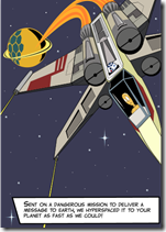
star wars birthday padawan yoda star wars birthday vader stormtroopers gift star wars birthday x-wing droid

star wars same birthday luke leia skywalker 2009033117034300781020951901_mdavict - I Am Your...(Cover) star wars birthday yoda candles


Star Wars Christmas Cards

I particularly like ud33n’s Santa Vader card, due to the joke on the inside, and the cutesy illustrations that he did up.

star wars christmas santa vader small star wars christmas death star x-wing

Star Wars Get Well Card

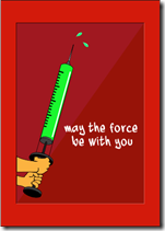
Most. Awesome. Get Well. Card. EVER!

star wars get well card lightsaber force


May the force be with you and our new SEO experiments :)

Thursday, June 17, 2010

5 tips to earn more freelance money

Not making enough money as a freelancer? The CEO of that eco-friendly card company gives a few tricks he’s learnt along the way.

Wake up at 10.30am, have a leisurely lunch with a friend, then head to Starbucks to check emails on a caffeine high. Doesn’t sound like a bad life… does it? I should know. I’ve spent the last three years off the grid, and now run a site that allows designers from all around the world to do the same.

It’s an attractive proposition, to do what you love, at your own leisure, and to earn everything that’s due to you. However, the reality is that you’ll probably start with flies in your bank account and desperate for cash, thus taking any cruddy job that comes your way. Soon enough, you’ll realize that you’re working on crappy projects 18 hours a day, but you’re barely making rent, much less affording an overpriced blended coffee.

Sound familiar? Here are a few tips to avoid that situation.

1. Getting started – The introductory rate.

Okay. So you’re just starting out and you wanna get as much experience as possible, which means doing things on the cheap to get more jobs. That’s admirable, and absolutely essential to the beginning of any unknown freelancer. The problem is, when you want to raise your rate later on, all your clients start complaining, so you find yourself slogging away at low-paying jobs.

The trick here is the INTRODUCTORY OFFER. Give a time line, something like “MARK is ON THE MARKET! From now until 31 March 2010, Photo sessions at only 100 bucks! While stocks last!”. This works awesomely for two reasons. The first is that it encourages your clients to snap you up in a limited time. The second, is that once the period is over, clients will expect the price to go up, or at the very least, beg you to keep it at that price for just one more job.

2. Offer value, not price.

I am constantly appalled by the wages paid for creative talents in this country. The reason, is that everyone is fighting each other over price. As a consequence, people tend to settle on a low price, and thus submit sub-par work. This is bad for the talent, the client and the industry as a whole.

Price should never be the only deciding factor. Yes, don’t be exorbitant (unless you know you can), but don’t undersell yourself either. The trick here is to ensure your client is interested in your work first before bringing up the topic of price. If they ask up front, be wary, and deflect the question by saying things like “It depends on what you want” (which is actually true). Every creative talent is different – in terms of style, speed of work, accuracy and so forth. Set yourself apart (show them your work, and be professional), and you’re on good grounds for negotiations.

From my experience, the clients that pay top dollar for you are the ones that will treat you best. Reciprocate.

3. The three month buffer

Once you’re getting a few jobs in, you might wanna start out at the local kopitiam before graduating to Starbucks. Trust me on this, you want to build a three-month buffer – basically enough money in the bank to survive without any income for three months.

Imagine that freedom. For the next 3 months, if you don’t get any jobs, you’re fine. Why are you doing this? Because a desperate freelancer is one that will be doing shitty work for shitty pay and forever after be expected to do the same. What you want to do is get to the point where people are bidding top dollar for your time, and you have the flexibility to say no.

4. Never say no.

Well, not to the client’s face anyway. Always offer a solution, even if it’s not from you. Here are some common ones.

  1. Job is too cheap or too short a deadline – Ask for a longer timeline, or a bigger paycheck, or both. If the client says this is impossible, then recommend someone else, and don’t be bitchy about it (yes, designers… you know who you are).
  2. Job is not your specialty – If you’re willing to learn a new specialty, charge to make it worth your while. Or better yet, if you really want to learn this specialty, offer them a discount but tell the client that you might need more time to learn and perhaps make a few mistakes
  3. You don’t do that – Even if it’s totally unrelated, don’t just say no. Recommend the client someone else. If the client sees you as a problem solver, they will bring more business to you. Also, referring business to others will often come back to you.

5. Be Remembered

If you’ve followed the steps above, your clients should have no problem recommending you to their colleagues or friends. HOWEVER, this is only the case if they remember to do so. Certain freelancing jobs (such as programming or accountancy) don’t really get people talking cos they don’t come out much in regular conversation.

What you need to do is to give them reasons to remember you. A memorable business card is a simple way of doing this. These days, you can get some really nice ones from moo cards for as low as US$20 for a pack of 100. Of course, depending on where you are, your local printer might be even cheaper, but watch for ways of making your card stand out. You might want to look professional, but remember that the purpose of a freelancer’s business card is to be remembered. While odd sizes are great, try not to exceed the measurements of a standard business card (89 × 51 mm), since people won’t be able to put em in their wallets, and probably end up losing or damaging them.

Also, if you can… work on people skills. Bond with your clients… don’t just talk about work. If you can find something in common with your client, their memory of you will take a huge leap, leading to them more easily remembering, and thus recommending you to other people.

-----------------------------------------

Why am I telling you all this? At the end of the day, alot of people are starting to come to the freelance side of things. If everyone undercuts each other, it’s bad for the industry as a whole (and good for those rich, godless, merciless corporations that we call clients). But if everyone starts differentiating, we get a bigger pool of talent that’s better paid, does better work and has a better overall reputation… so everyone wins :)
Before I end, I have to say that all this advice comes with two caveats. The first is that everyone works differently, so if you don’t agree with these tips, I’d love to hear how you do it at chak [@] foldees.com.

The second, is not to try looking for me at Starbucks at 1030am cos I usually get up at 11.

And I make better coffee at home.

This article first appeared in CUTOUT Magazine’ JULY 2010. Do check it out at newstands in Malaysia.

Wednesday, May 5, 2010

Kuala Lumpur Design Week 2010 @ Cap Square KL Part 3 – Everyone Else

Welcome to Part 3 of our KL Design Week coverage. It’s now Day 4 (Tuesday), and to be honest, quite quiet during the weekdays here. KL Design Week (105)

(LEFT: note the enthusiasm on these two young un’s from Wall-Tailor)

On the bright side though, we do have plenty of opportunity as you can see, to blog and twit more than we ever have before (our regular followers will notice the upspike in activity over the last 3 days).

Anyways, now that we’ve covered our neighbourhood, we’re going wandering around the rest of CapSquare KL, which we can only say has been infested with color and plastic glasses in all areas!


First off, in all areas, you’ll find these cute little Secret Tents, in which hobbyists and students can sell their handcrafted wares.

KL Design Week (101)

KL Design Week (98) KL Design Week (109)KL Design Week (118)


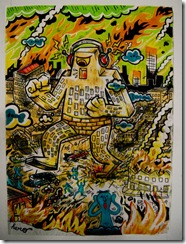
I actually bought a rock off this guy… Jux, who loves drawing incredibly detailed skylines with little godzillas and pandas running around. Very Cool.

KL Design Week (113)KL Design Week (112)KL Design Week (117)


Downstairs in the main hall, things were surprisingly even more quiet, with mostly foreign exhibits, and a few more tents. This artist, Olivier, was representing a french studio called Hero Studio.KL Design Week (87)KL Design Week (90)KL Design Week (89)


There was also this kinda cool precision projection thing that made this look like moving billboards.

KL Design Week (97)


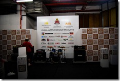
This was the main stage, which was pretty much the only exposure evailable for the sponsors.  It was also the place where Mukhriz Mahatir gave his speech. I don’t understand why in Malaysia, we all clap for these VIPs we don’t respect, even when they are 2 hours late. It’s so weird.

 KL Design Week (108)KL Design Week (99)


Some other artwork. Can’t remember the artists… sorry! But nice though…

KL Design Week (92) KL Design Week (93)KL Design Week (91)   KL Design Week (114)    

The last picture is my friend Thomas doing the Magnum. Incidentally, Thomas was once the king of Quake in Malaysia. He now works in a local audio studio called White Noise.

On the 2nd floor of Cap Square, there’s a very promising student exhibition. Although I’ve said it several times before, I’m continually impressed by the level of talent here in Malaysia, and sad that alot of it goes unnoticed.

Here’s an interesting one. It’s a fully 3-D display, which was displaying polygonal logos and models. Although not quite up to tony Stark standard yet, it was pretty impressive!

KL Design Week (119)


Then there was this great character designer, with his Orang Minyak and Chinese Vampires. Very Cute…

 KL Design Week (135) KL Design Week (136)

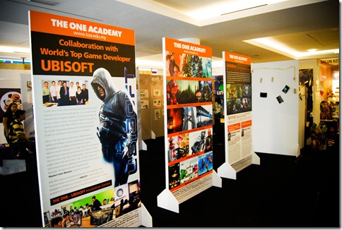
And then there was the work from the One Academy people, including their work with Ubisoft (only like the 2nd biggest game publisher in the world!).

KL Design Week (121)


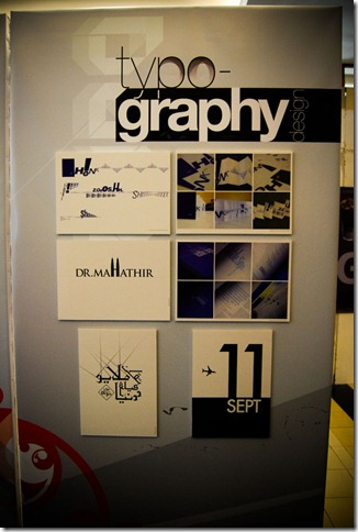
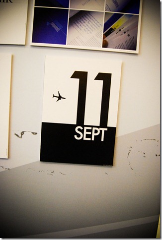
Next door to the ONE Academy booth was the UITM booth, with some very interesting typography work.

KL Design Week (122) 

We couldn’t help but chuckle at what a wandering American tourist might think of this last one, considering that UIAM is the biggest Islamic University in the region.

KL Design Week (123)


Also on display were some really cool product designs, like these Handcuff-like clothes hangers.

KL Design Week (127)KL Design Week (128)KL Design Week (129)KL Design Week (130)


And then there was the very morbid work of Dayana, who is possibly the sweetest looking girl i know who listens to DEATH METAL. Nine Inch Nails might as well be Westlife :)

KL Design Week (134)KL Design Week (132)KL Design Week (133)KL Design Week (131)

And finally some nicely dressed toilet bowls and mannequins for good measure.

KL Design Week (124) KL Design Week (125) KL Design Week (126)        

that’s it for now, from Cap Square. If anyone has any other articles about KL Design Week, do let me know and I’ll pop it in here as a link.

Not sure if there’ll be a part 4, so for now, Goodnight and Goodbye from Cap Square KL!