Hey guys… in case you can’t make it this year (and shame on you), or to entice you to come, here’s a rundown of what you’ll find at KL Design Week 2010! I’m posting this live, thanks to P1’s free Wireless KL service (although I’m pretty sure i’ll be using up my 500MB limit posting this up!)
Anyways, here’s the rundown on KL Design Week. It’s basically the 2nd year this is happening, and it’s a city-wide event to draw all those hibernating and hiding artists out of their immaculately designed cubby holes.
Here in Cap Square, it’s the design showcase. There are students, hobbyists, and full-blown businesses here, all cheerfully side-by-side, some selling, some not. Don’t worry, we are :)
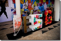
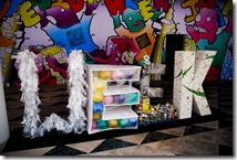
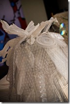
Here’s the awesome marquee outside by Raffles International College, made of 100% recyclable goods (except maybe for the plastic tomatoes… hmm..
We got the booth quite last minute, so we basically spent a total of RM54.80 on design, consisting of a few large format prints, sticky-tape and a box of 2B pencils to replicate the background of our website.
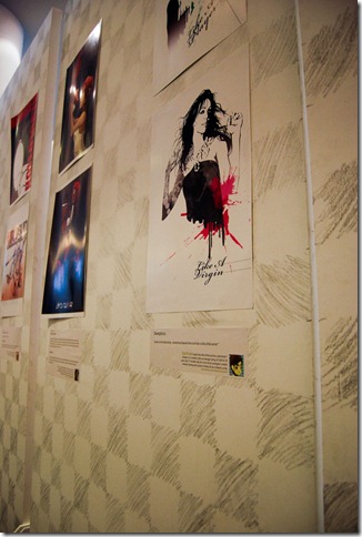
RichardLee’s Wang Lee Hom typography was a real hit – a Swedish guy even asked for a poster!
Oh yea, and the sticky tape was really crap. We kept having to restick them three times a day.
And of course an endless stream of people checking out the cards…
It’s not really optimal to be working on Labour Day, but we’re glad we did!
(… coming up in Part 2, the other exhibitors!)
PS: Don’t forget you have only two more weeks to get your designs in for A Modern Fairytale! Only at www.foldees.com/contest.


3 comments:
how cool!!!! i saw mine!
CHAKK! :D Got close up of my typography? HHEHEH! Thanks Chak! :D
Ching... gotttt. I edit and upload later. My bandwidth here finis already. Hehehe.
Emila, how's the Peugeot?
Post a Comment